The Client
Crawford is an established business sales support and growth consultancy. Briefed to create a new corporate identity for the business, we delivered a consistent look and feel across all collateral. This was based on one simple but effective unifying principle: strength and ambition.
The Approach
Our creative approach for Crawford’s corporate brand identity conveyed growth, support and change in its key client bases, manufacturing and engineering. Having researched the market, its competitors and customers, we created a theme of ‘reaching the highest point’.
This position reflected Crawford’s unique attributes, while reflecting the ambitions of its clients.
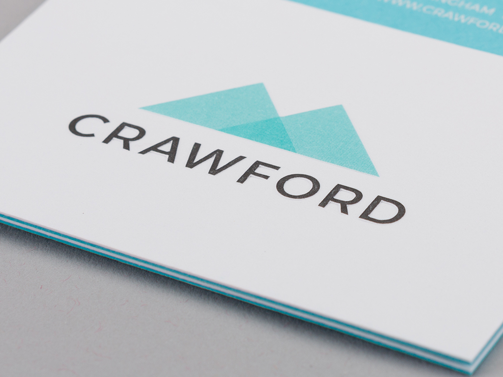
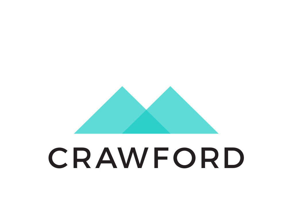
The twin triangle shape of the new logo represents both convergence and strength at its base, and wisdom and growth at its two highest points. The triangle’s foundations are strongly linked to the Crawford name, while the overlapping triangles depict progress from this strong base.
We selected the font Montserrat in capital form to reflect stability and seriousness. This is a beautiful typeface, encapsulating stern professionalism, and an open, honest approach.

The Result
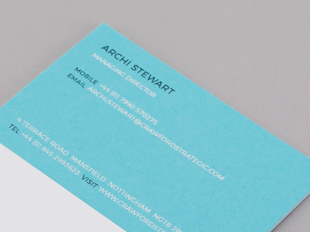
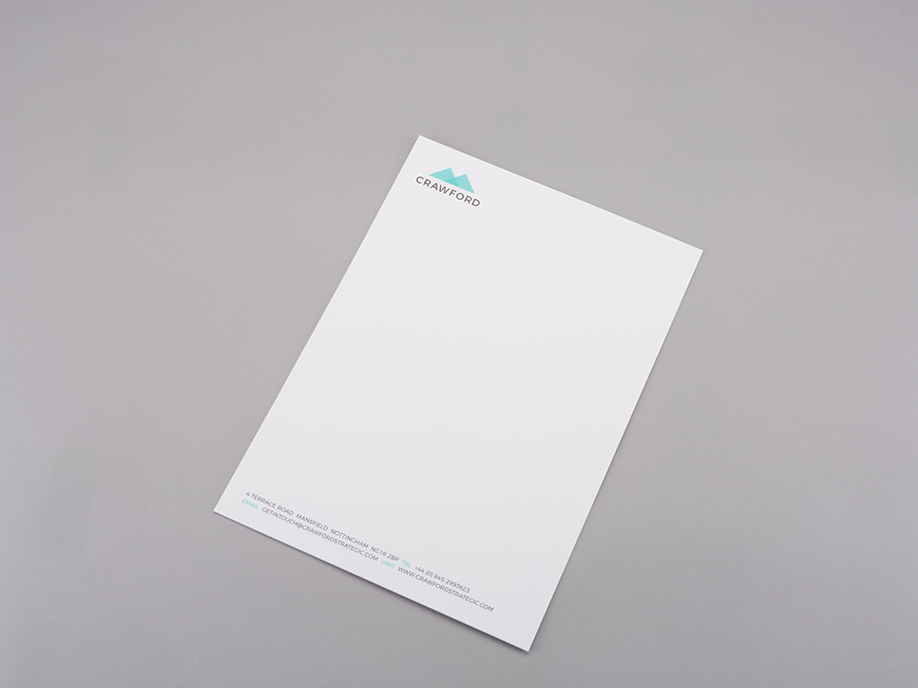
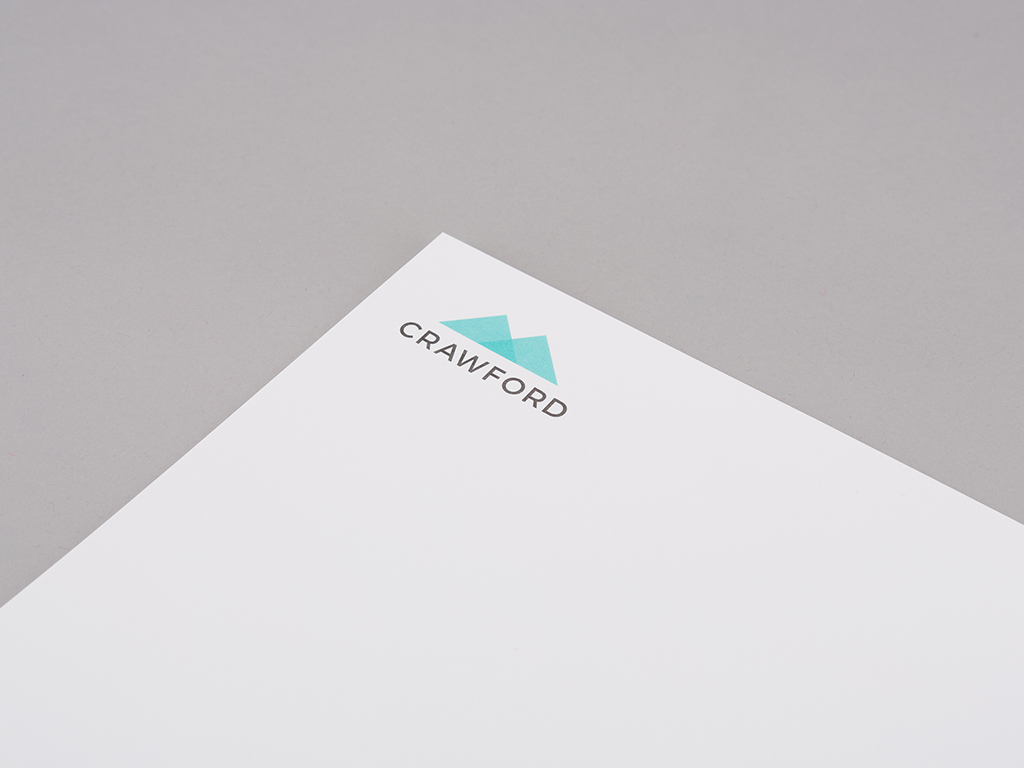
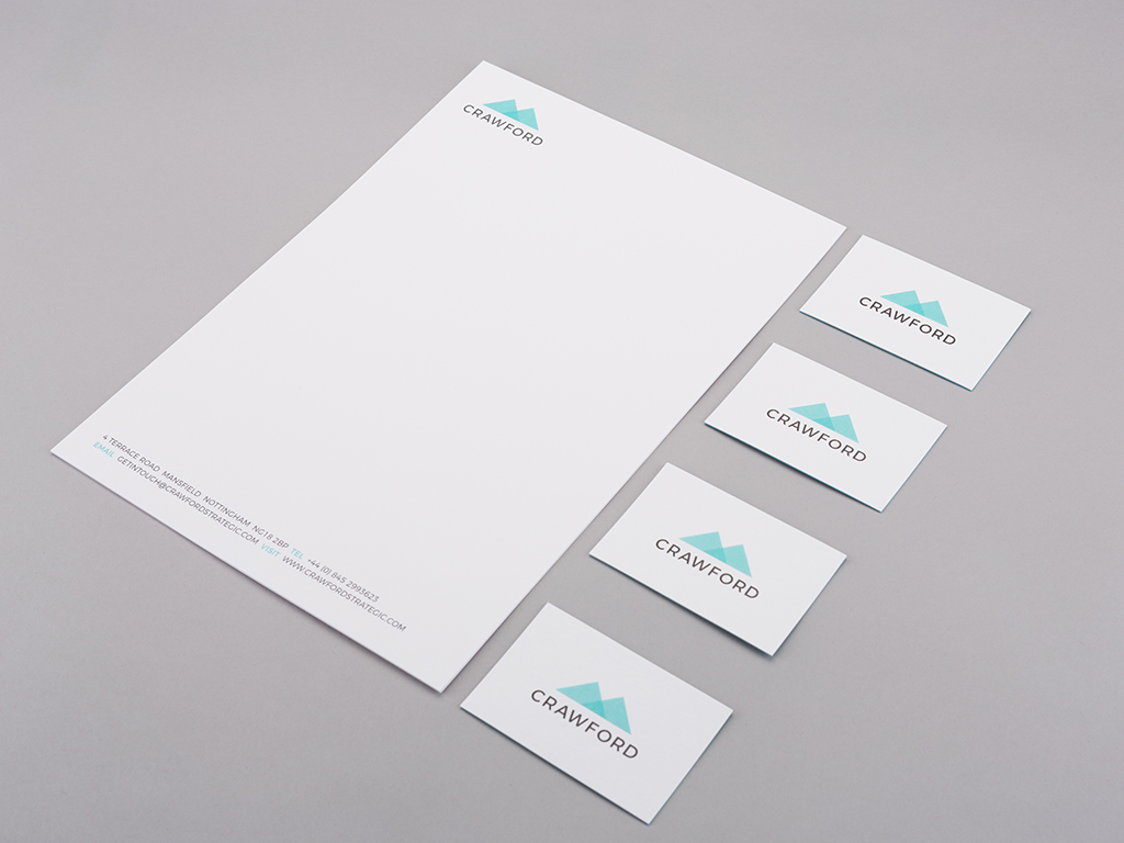
“Our new brand is a big hit! The design and quality of our business cards and letterheads are excellent and have led to new collaborations for Crawford.”
Archi Stewart
Director – Crawford
Ready for the journey?
If you’d like to work with a full service marketing agency with an ever growing reputation for ground-breaking creativity, we’d love to work with you. Let’s start with a coffee and a chat.
0115 7523869 | hello@inbetweencreative.co.uk


